

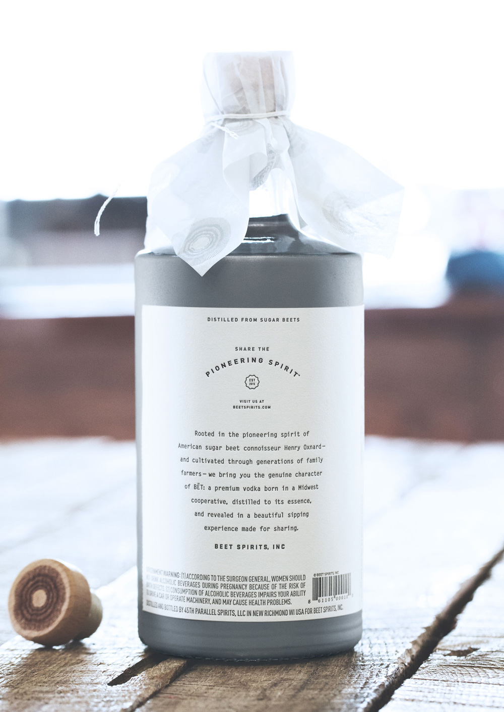
BĒT VODKA
Made for Sharing
A holistic brand, package design and campaign experience was created for the launch of a premium-pour sugar beet vodka originating from midwest farming cooperatives. The brand positioning’s three pillars—sincere, simple and social— guided the naming of BĒT, it’s clean, tactile approach to packaging and extended it’s honest, genuine image through digital and social experiences. The result was a discerning yet approachable brand with a story rooted in relationships.


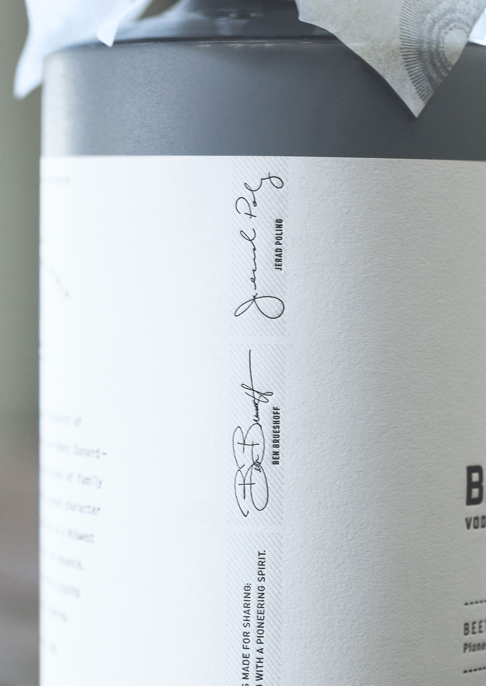
Every aspect of the exquisite, highly tactile package was considered. Debossed and die-cut, the brand demonstrated their belief in pure, clean simplicity. A cross-section of the sugar beet was printed on a custom hand-tied wrap to complete the experience.


The brand was launched with an elevated press kit that included sample-sized vodka meant for sharing. The entire experience encapsulated BET’s brand pillars: sincerity, simplicity, and social connection.


CREDITS
/
While creating this work, Jillian Frey
was a Creative Director at Knock Inc.
was a Creative Director at Knock Inc.
...
The House of is an INDEPENDENT, BOUTIQUE, advertising & design studio that collaborates with ESTABLISHED, EVOLVING, and EMERGING brands
/
(C) STUDIO@THEHOUSEOF.COM
(IG) @THEHOUSE.OF
© 2024 The House Of